
Your Guide to Creating a Stunning Colour Scheme
Don’t know where to start when choosing a colour scheme? In this article, Jen shares her insider tips on how to create a colour design you’ll love to live with.

Deciding on a colour scheme for your entire home, or just one room, can be overwhelming. In this article, I break down how to approach colour, giving you insider interior design tips for landing on something you’ll love to live with.
Even if you are starting with one room, you’ll want to consider your whole house so things don’t jar as you move through each space. This doesn’t mean using the same colour throughout, but you’ll want something that hangs everything together. I love rich, earthy, autumnal colours so when we renovated our home, I knew my base colour palette would be rich and warm. I also love black as an accent colour and this runs throughout the key spaces.
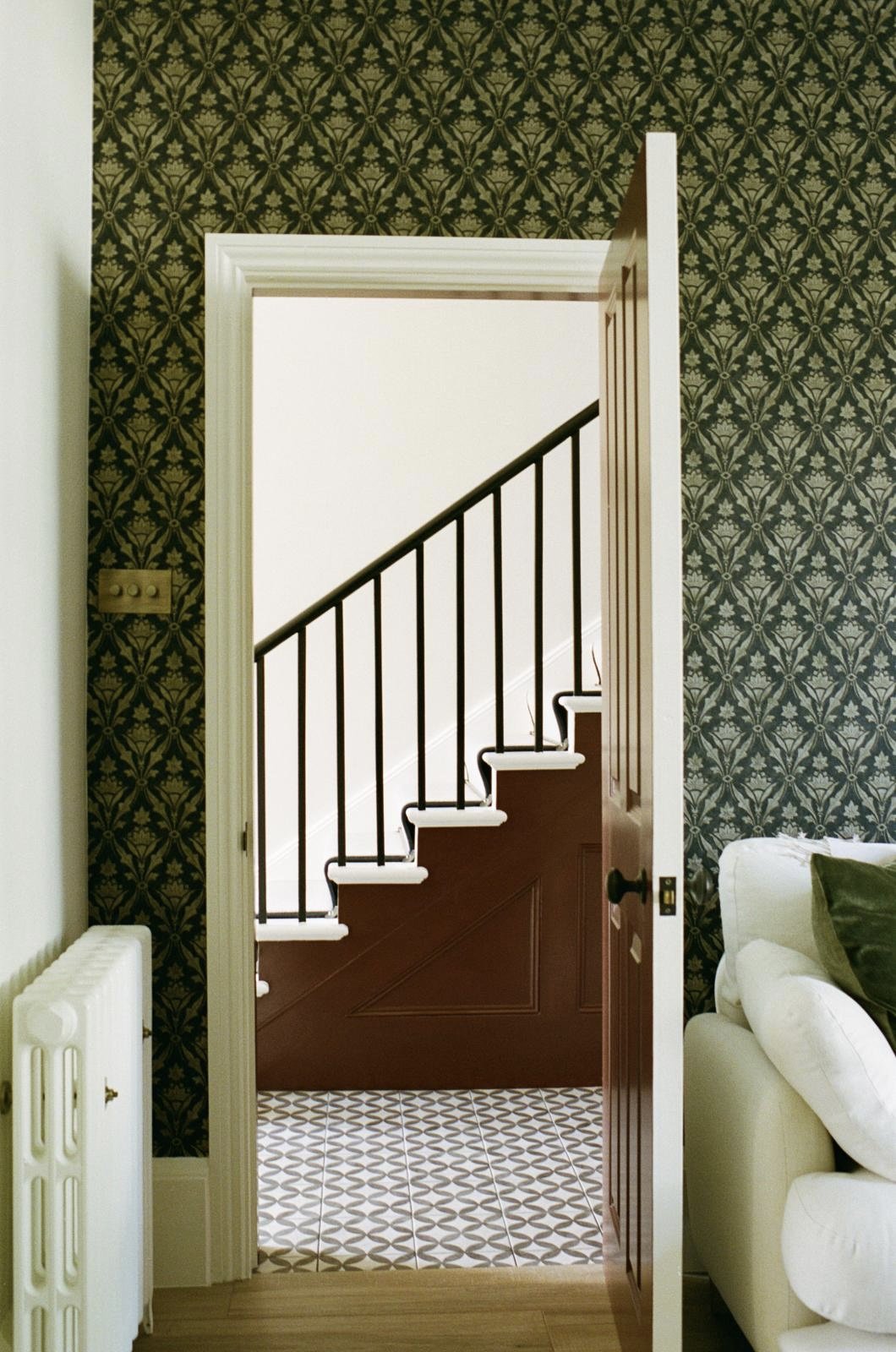
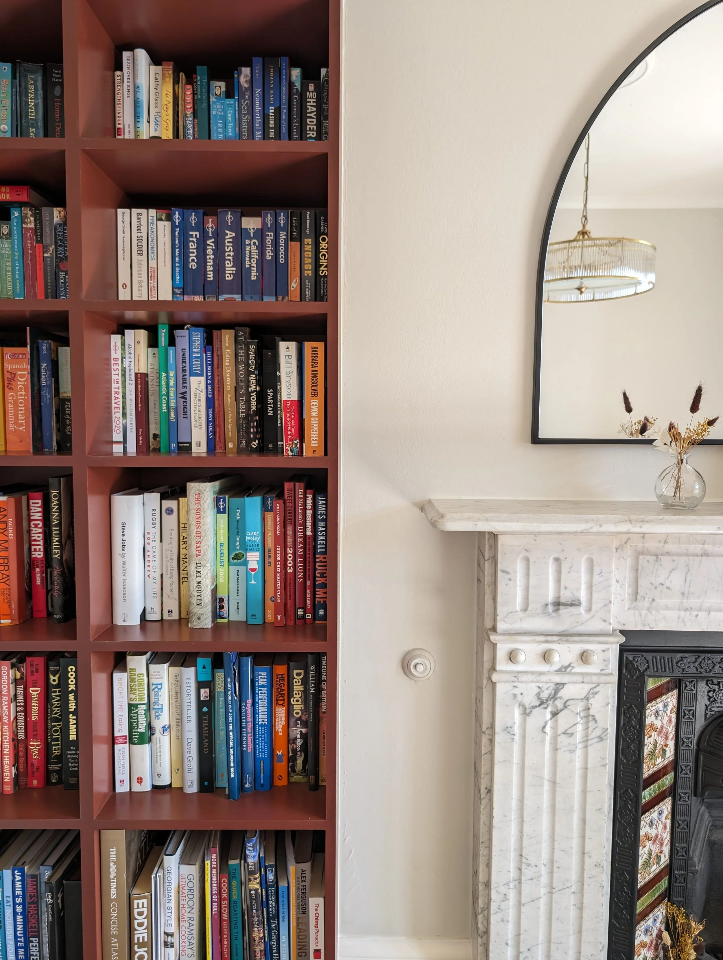
Consider what you already have in the room that you can’t or won’t change (like floor coverings and key items of furniture) and take cues from what already exists. Not only can these inspire you in terms of colours, but you’ll want to ensure anything you do choose, works with them. Our lounge has an original fireplace with beautiful decorative tiles featuring a deep red. This colour translated to become the accent colour for our bookcase as well as the hallway doors and even the front door.
Use colours you’re instinctively drawn to. In fact, your wardrobe is a great place to start when designing your home. We all tend to gravitate towards wearing a particular blend of colours. If you’re into a bright, maximalist dress style, chances are that you’ll love to live surrounded by this vibe in your home. Unsurprisingly my wardrobe contains a lot of earthy greens and mustard yellows. I’m a heritage tone, autumn fan and living surrounded by these colours makes me feel happy.
Choose your hero colour and use the tools from your paint manufacturer to see what works well with this. From Farrow & Ball to Edward Bulmer through to Little Greene Paint, they’ll all have colour cards and colour collections to show you which colours work best together. Colour scales are also brilliant - they show colours as part of a graduated family and will help ensure that you simply can’t go wrong.
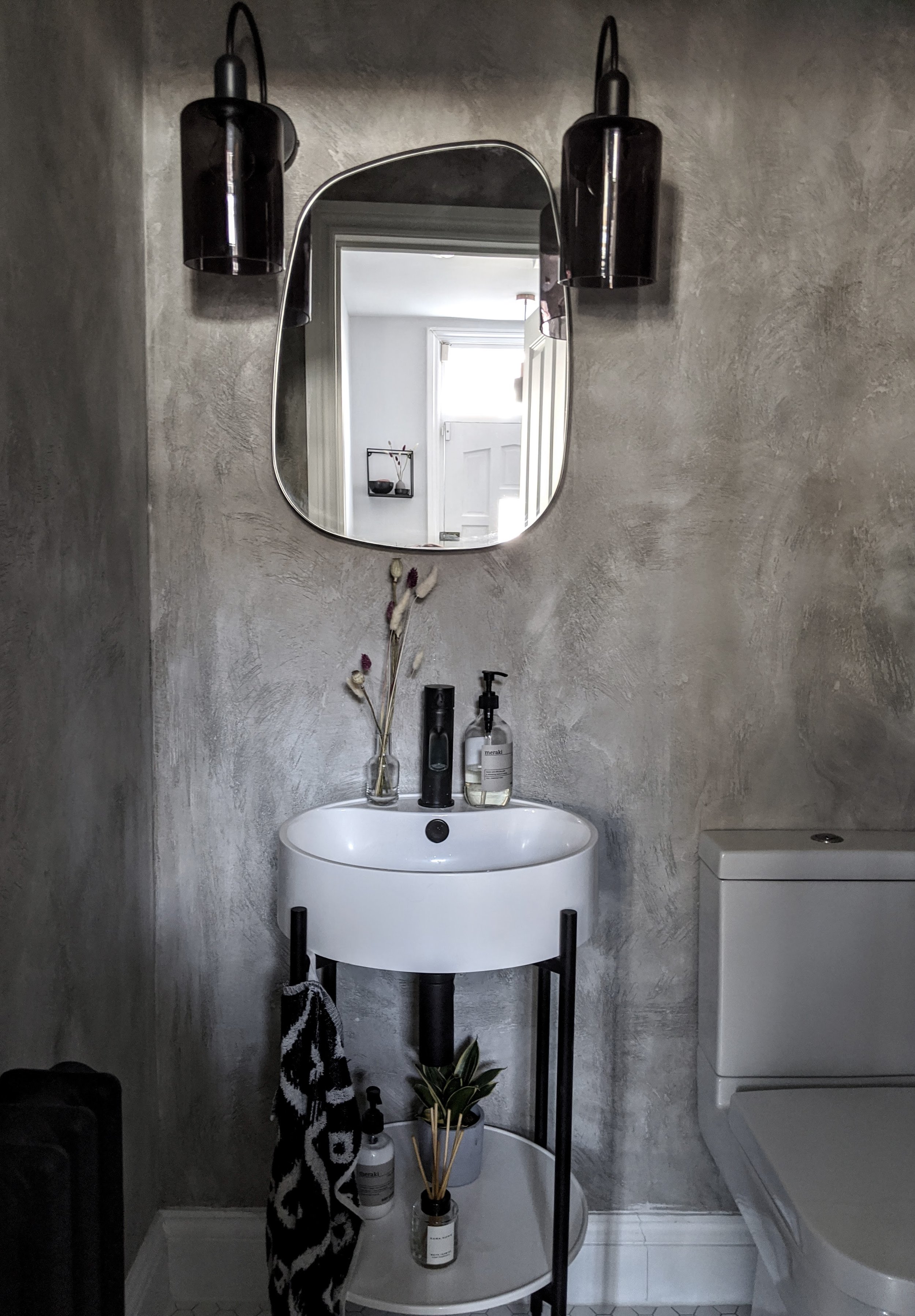
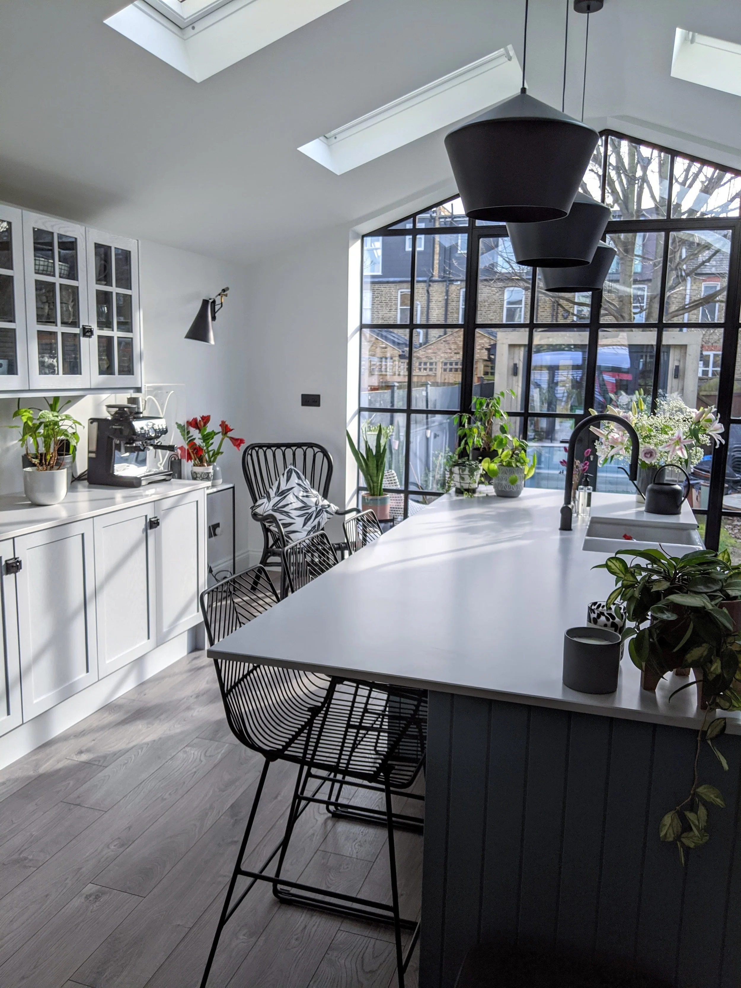
Considering the purpose of each room can help you decide what to do with it colour-wise. Will it be a hub of activity, a relaxing space or a space for guests? Our kitchen/living space is a hubbub of crazy and it’s here I’ve brought in some bold raspberry colours and a funky Wendy Morrison rug. If you’re tempted to try something a little bit outside your comfort zone, utility spaces and toilets lend themselves to more playful schemes. I chose pink and an almost jet black for our downstairs loo (and pink isn’t my thing) but it works so well in an otherwise fairly boring room!
Don’t forget the ceiling, skirts and doors. The ceiling is often referred to as a fifth wall, it’s a large space and can make a big impact. Dark walls and ceilings can make a large room feel smaller and cosier whilst lighter colours can make it feel larger. Painting the walls the same colour as the ceiling draws up the eye and makes it appear to be a larger room with a higher ceiling. Whatever you do, don’t default to painting your doors, skirting boards and ceilings pure white without considering how this works with everything else. The colour you make them will have a huge impact on the look of the entire space. I rarely, if ever, use pure white even if I want a light bright ceiling. For me, it’s too stark and I’d rather opt for a warmer tone like a Farrow and Ball Wimborne White. The 60:30:10 rule is a classic one to help you decide how and where to use different tones and colours where 60% of the room is your main colour 30% the secondary and 10% an accent.

Once you’ve shortlisted your colours, paint swatches of them on the walls in the space you’re redecorating and live with them for a little bit. The way the light hits will completely change the paint colour. North and East facing rooms get cooler light and you might want to use warm undertones to create a cosier feel. South and West facing rooms receive a warmer light and can take stronger undertones. I like to have swatches on the walls for a couple of weeks to see how they make me feel. Are there some I don’t gel with as much versus others that feel right? The way a colour scheme makes you feel in a space is important.
Your home is your sanctuary, and the way you choose to decorate it should be a reflection of you. Take your time with working out what you’re drawn to and how the colours might work for you, consider the space carefully and test and trial. Good luck!
Written by - Jenna Hewitt